Relaunching a hotel in 6 weeks
It was just another typical day in the office. Pinging into our inbox came an email from one of our regular clients, Clermont Hotel Management. “Can you do a rebrand for one of our hotels and get logo concepts back to us on Thursday?” It was already Tuesday.
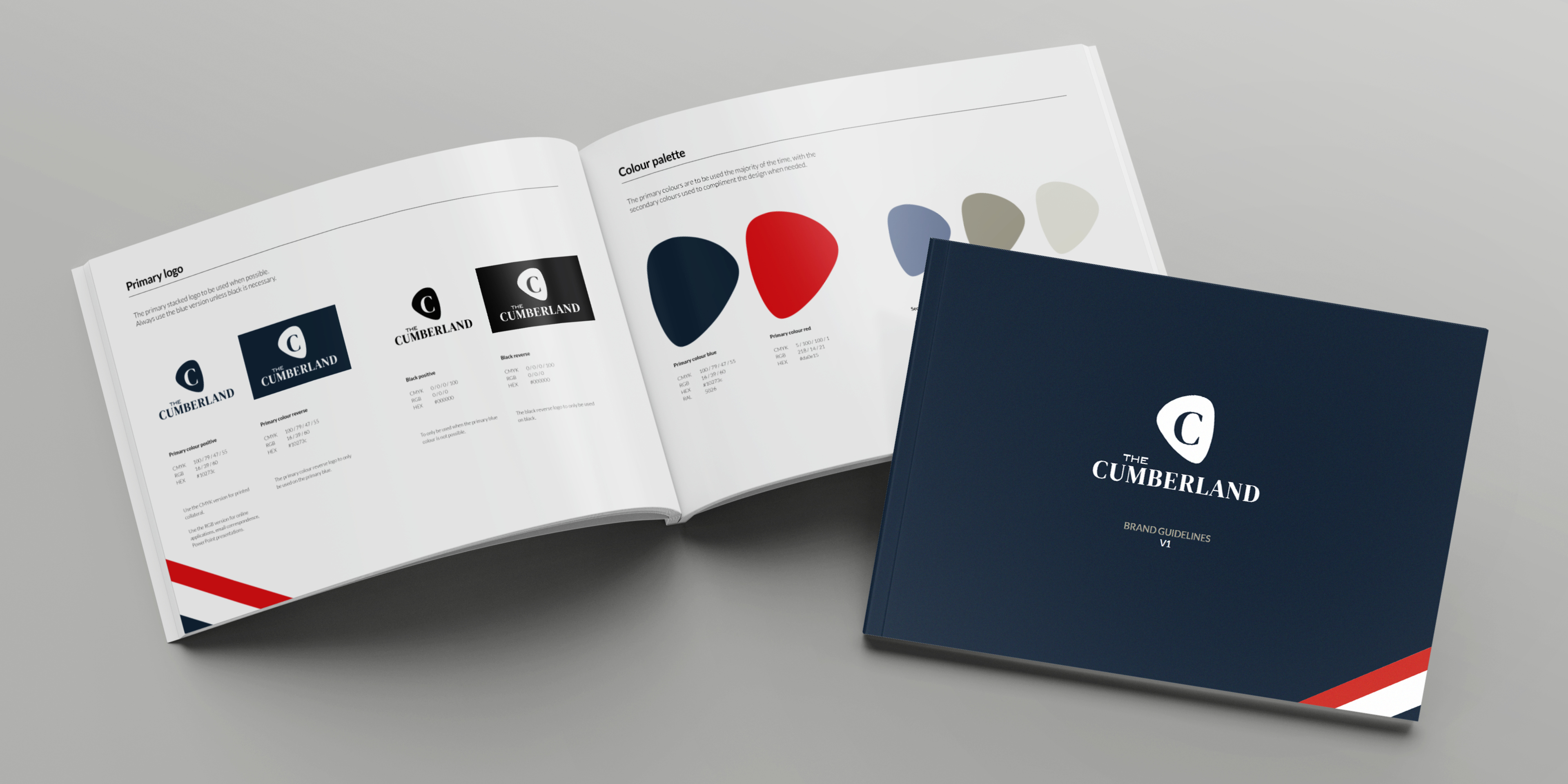
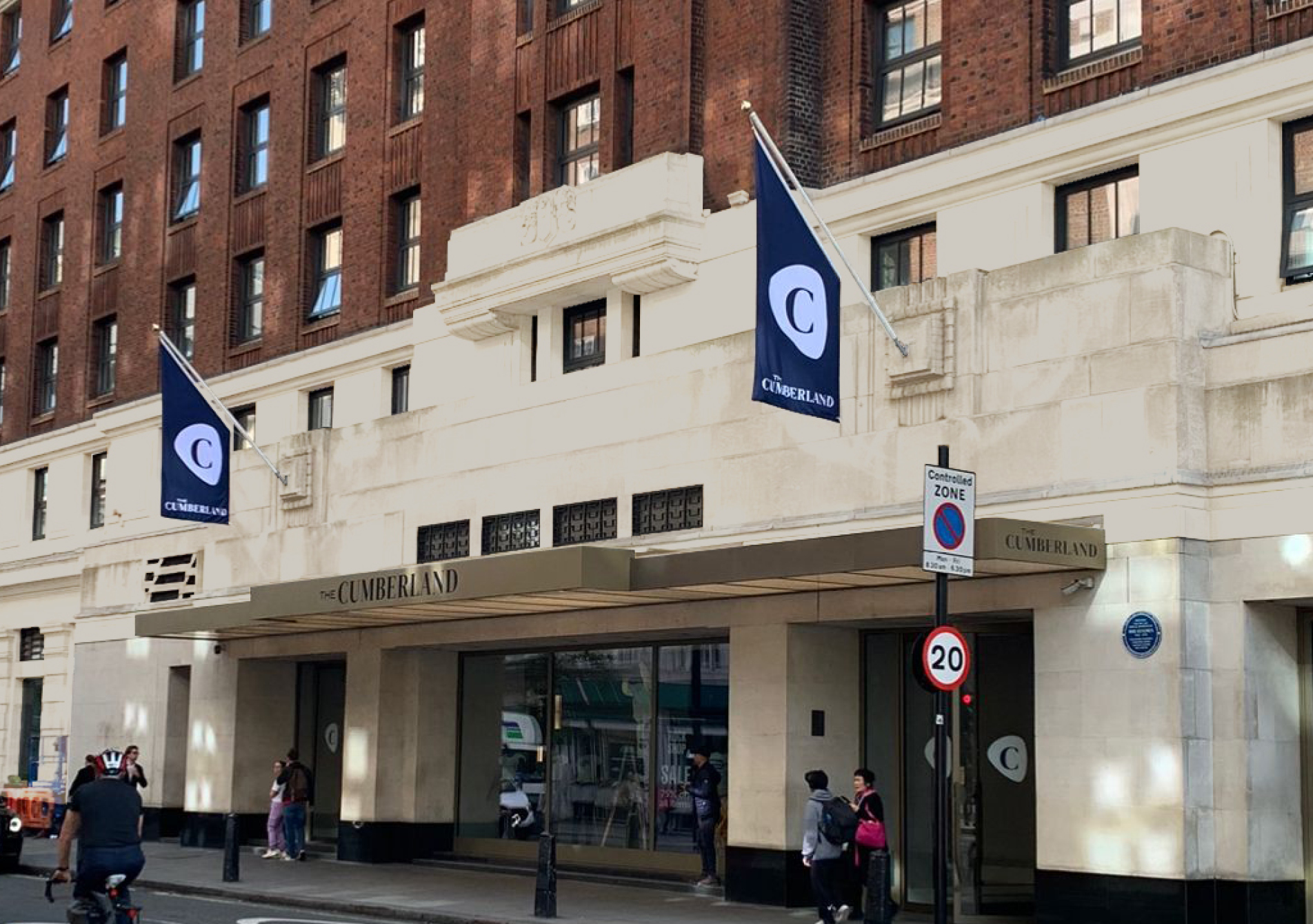
That was just the beginning. The Hard Rock Hotel London was soon to be reverting to its previous name of The Cumberland, while retaining its music-themed guest experience. It required a complete overhaul of the branding and logo.
Our designers put in the hours on the development, meeting the deadline and proposing three well thought out concepts based around the hotel’s rich links to the music industry.
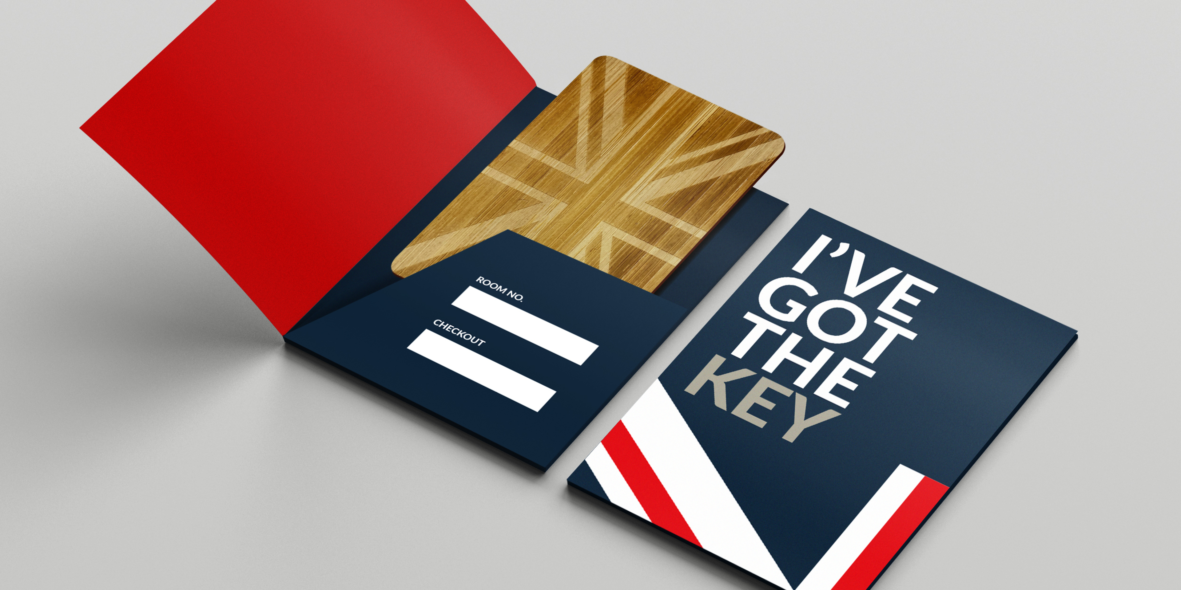
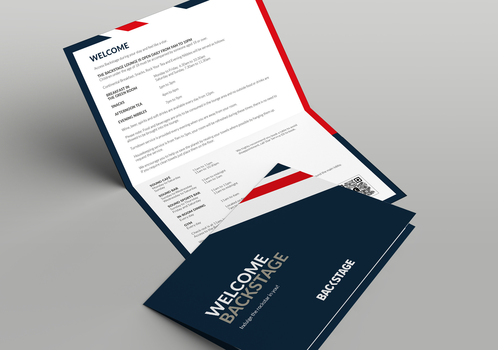
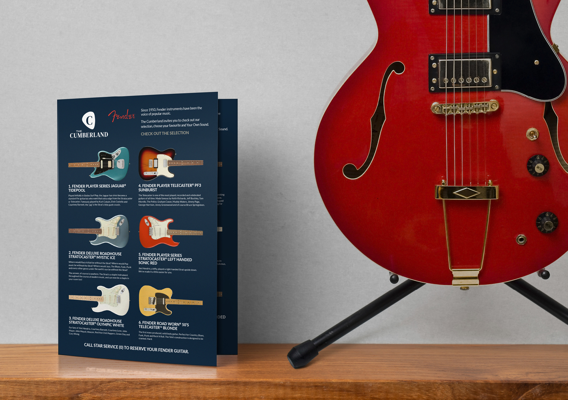
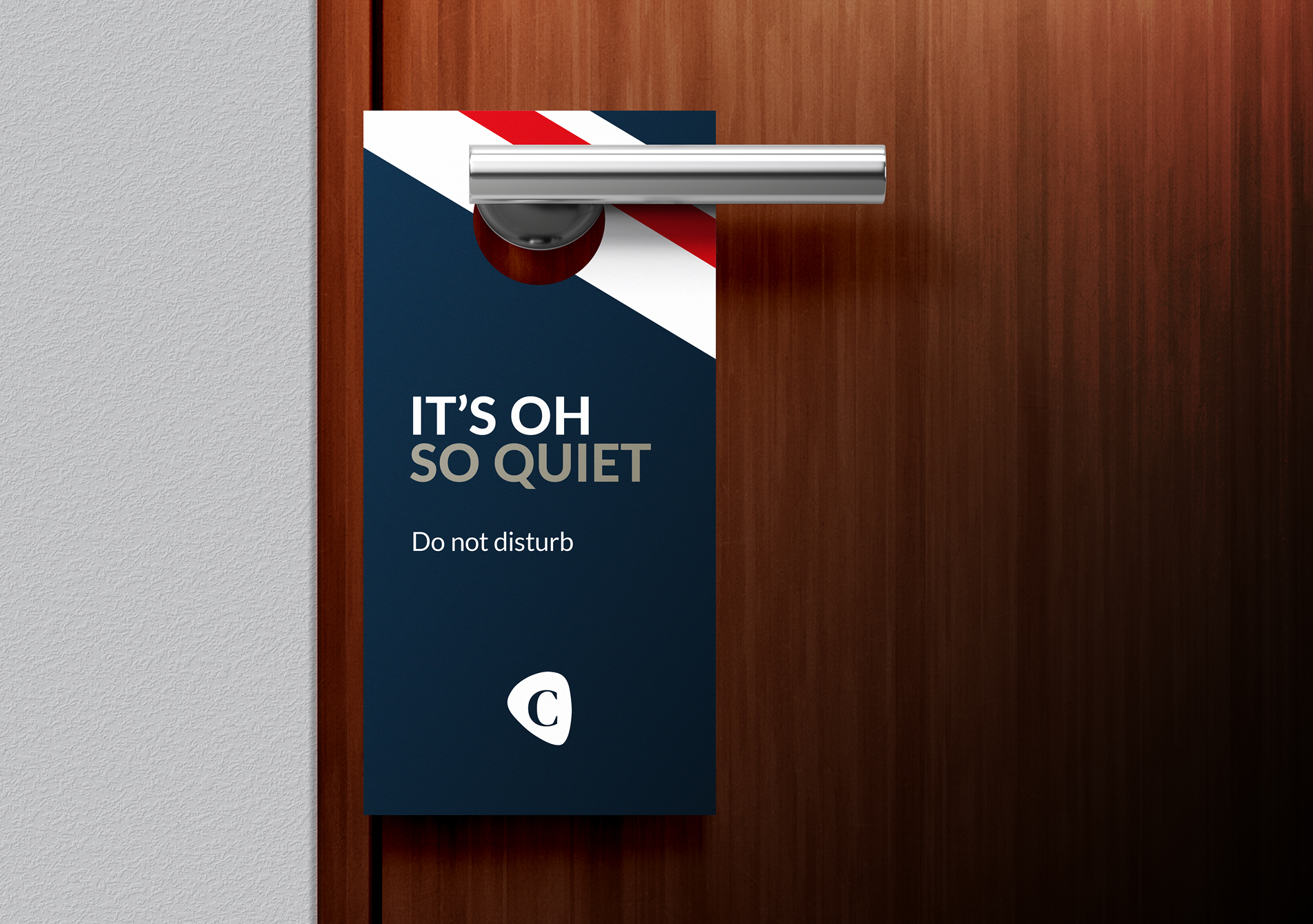
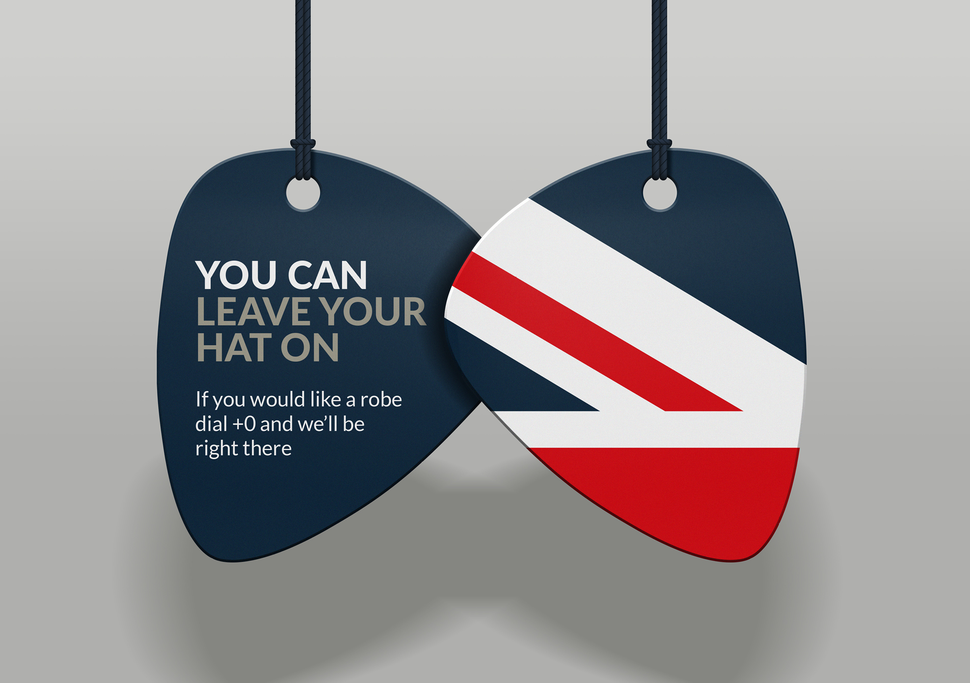
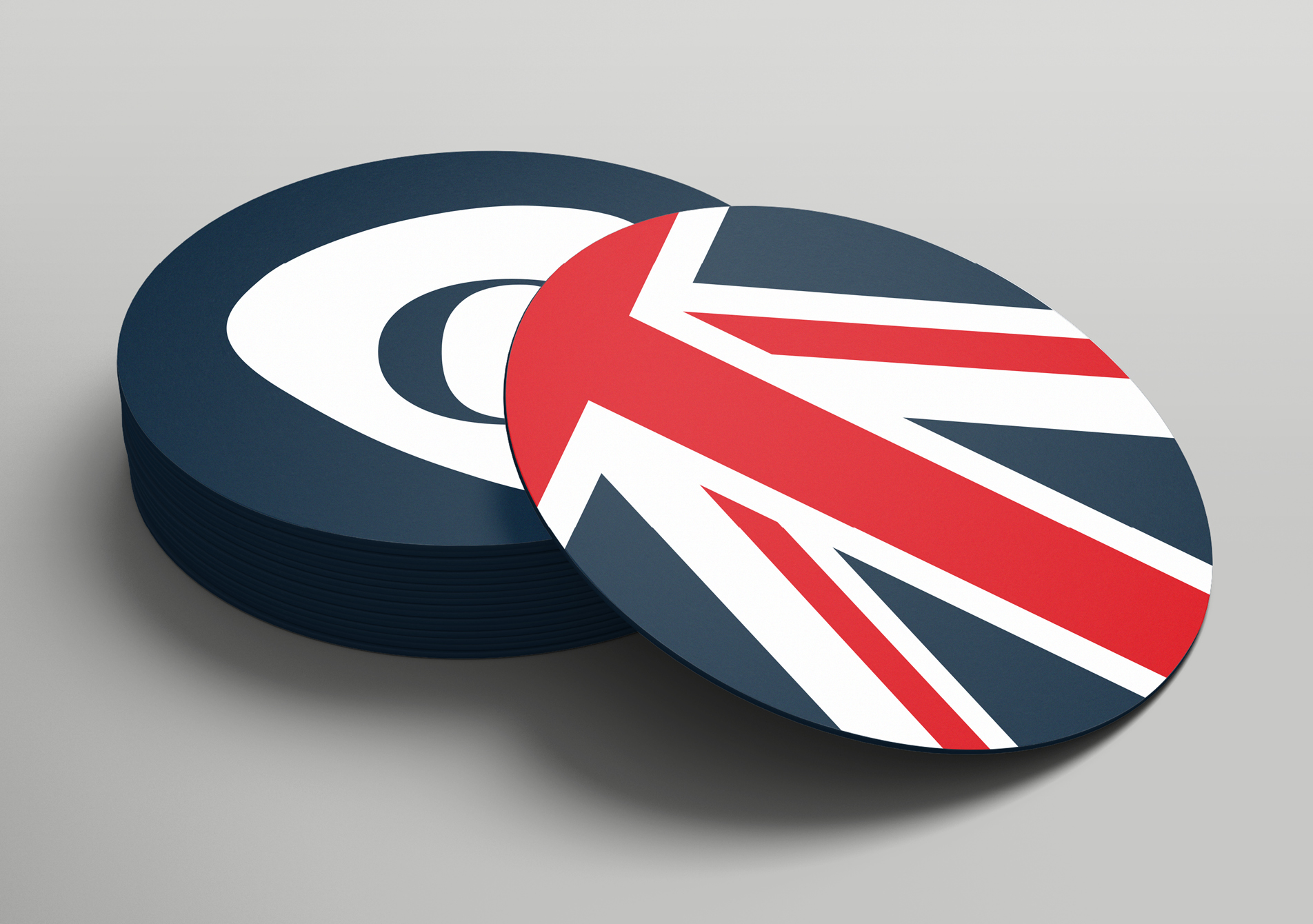
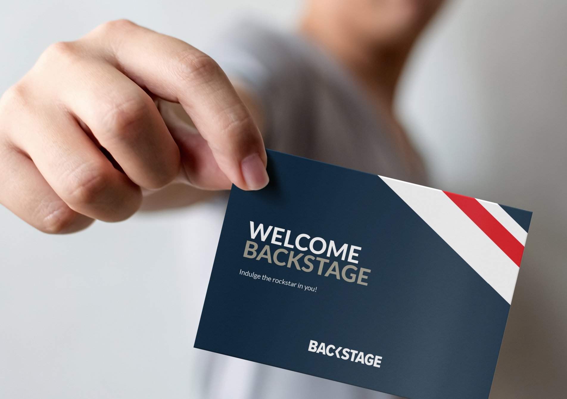
It wasn’t just about the design of the shiny new plectrum-inspired logo, we also had to roll out the brand across all the print design collateral throughout the hotel, including external signage, key cards, door hangers, robe tags, drinks cards, welcome cards, housekeeping cards and much more. 50+ items and counting, in fact.
The team created a suite of dynamic collateral, re-establishing its British heritage, ready for the launch on 17 May, just six weeks after we received the initial brief.
With crazy deadlines pretty much our norm, we know how to pull out all the stops when it’s needed. If you’ve got a case of deadline-panic, call us, we’re ready to meet the challenge.


